Congratulations! Your hard work is done. Now it is time to package it and share your work with the world. But, before we do that, let’s review what we’ve done.
Check Your Project Directory
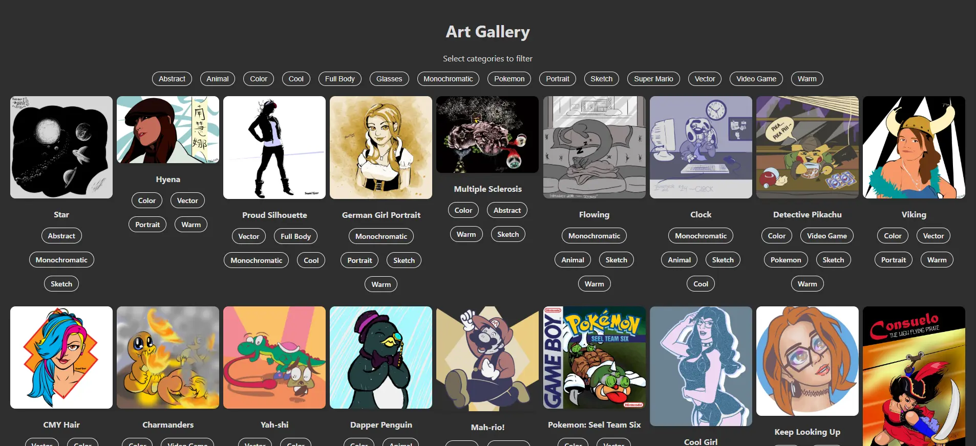
Your list of folders and files should look like this:
react_art_gallery
├── README.md
├── node_modules
|   └── All the installed package files live here
├── package-lock.json
├── package.json
├── .gitignore
├── public
|   ├── images
|   |   └── Your artwork that's featured in your gallery
│   ├── index.html
│   └── robots.txt
└── src
    ├── App.css
    ├── App.js
    ├── ImageCard.js
    ├── ImageGallery.js
    ├── images.json
    ├── index.css
    └── index.js
Double-Check Your Work
Click the file listed below to review the completed code for the component, stylesheet, etc.
App.css
This CSS file holds all styles for your App, ImageGallery, and ImageCard components.
.App {
  text-align: center;
  padding: 20px;
  min-height: 100vh;
}

.gallery {
  display: grid;
  grid-template-columns: repeat(auto-fill, minmax(200px, 1fr));
  gap: 8px;
  justify-items: center;
}

.image-card {
  text-align: center;
  max-width: 200px;
}

.image-card img {
  max-width: 100%;
  border-radius: 10px;
  box-shadow: 0 4px 6px rgba(0, 0, 0, .1);
  cursor: pointer;
}

.categories {
  margin-top: 10px;
  margin-bottom: 20px;
  display: flex;
  flex-flow: row wrap;
  gap: 1em;
  justify-content: center;
}

.category-pill {
  padding: 5px 12px;
  background-color: #333;
  color: #f1f1f1;
  border: 1px solid #f1f1f1;
  border-radius: 20px;
  font-size: 14px;
  font-weight: 500;
  transition: all .3s, color .3s;
  cursor: default;
}

.category-pill:hover,
.category-pill.active {
  background-color: #428645;
}

.popover {
  position: fixed;
  top: 0;
  left: 0;
  right: 0;
  bottom: 0;
  background-color: rgba(0, 0, 0, .7);
  display: flex;
  justify-content: center;
  align-items: center;
  z-index: 1000;
  opacity: 0;
  visibility: hidden;
  transition: opacity .3s ease, visibility 0s .3s;
}

.popover.show {
  opacity: 1;
  visibility: visible;
  transition: opacity .3s ease, visibility 0s 0s;
}

.popover-content {
  background-color: rgba(0, 0, 0, .7);
  padding: 25px 50px;
  border-radius: 8px;
  position: relative;
}

.popover-content img {
  max-width: 100%;
  max-height: 80vh;
  object-fit: contain;
  box-shadow: -5px 5px 10px rgba(0, 0, 0, .7);
}

.close-button {
  position: absolute;
  font-size: 1.25em;
  font-weight: bold;
  top: 10px;
  right: 10px;
  background-color: #f96e46;
  color: white;
  border: none;
  border-radius: 50%;
  padding: .25em .5em;
  cursor: pointer;
}
App.js
This JavaScript file is the stage for all your other components and includes all high-level functionality to properly pass along properties and capture/process events.
import { useEffect, useState } from 'react';
import './App.css';
import ImageGallery from './ImageGallery';
import data from './images.json';
const shuffleArray = (array) => {
const shuffledArray = [...array];
for (let i = shuffledArray.length - 1; i > 0; i--) {
const j = Math.floor(Math.random() * (i + 1));
[shuffledArray[i], shuffledArray[j]] = [shuffledArray[j], shuffledArray[i]];
}
return shuffledArray;
}
function App(){
const [filters, setFilters] = useState([]);
const [images, setImages] = useState([]);
const [selectedImage, setSelectedImage] = useState(null);
useEffect(() =>{
const shuffledData = shuffleArray(data);
setImages(shuffledData);
}, []);
const toggleFilter = (category) => {
setFilters((prevFilters) => {
if (prevFilters.includes(category)) {
return prevFilters.filter((filter) => filter !== category);
} else {
return [...prevFilters, category];
}
});
}
const uniqueCategories = [...new Set(images.flatMap((image) => image.categories))].sort();
const filteredImages = filters.length === 0
? images
: images.filter((image) => filters.every((filter) => image.categories.includes(filter)));
const [selectedImage, setSelectedImage] = useState(null);
const openPopover = (image) => { setSelectedImage(image); }
const closePopover = () => { setSelectedImage(null); }
return (
<div className='App'>
<h1>Art Gallery</h1>
<p>Select categories to filter</p>
<div className='categories'>
{uniqueCategories.map((category) => (
<button
key={category}
className={`category-pill`}
onClick={() => toggleFilter(category)}
>{category}</button>
))}
</div>
{
filteredImages.length === 0
? (
<p style={{ color: 'red' }}><em>No images found for the selected categories.</em></p>
)
: (
<ImageGallery
images={filteredImages}
toggleFilter={toggleFilter}
/>
)
}
{
filteredImages.length === 0
? (
<p style={{ color: 'red' }}><em>No images found for the selected categories.</em></p>
)
: (
<ImageGallery
images={filteredImages}
toggleFilter={toggleFilter}
onImageClick={openPopover}
/>
)
}
{
selectedImage && (
<div
className={`popover ${selectedImage ? 'show' : ''}`}
onClick={closePopover}
>
<div
className='popover-content'
onClick={
(e) => e.stopPropagination()
}
>
<img
src={`${process.env.PUBLIC_URL}${selectedImage.src}`}
alt={selectedImage.title}
/>
<p>
{selectedImage.title}
</p>
<button
className='close-button'
onClick={closePopover}
>
×
</button>
</div>
</div>
)
}
</div>
);
}
export default App;ImageCard.js
This is the child component of ImageGallery.js. This component renders the individual images along with their corresponding categories and titles. It also triggers the event to display the image’s full-screen Popover.
const ImageCard = ({ image, toggleFilter, onImageClick }) => {
  return (
    <div className="image-card">
      <img
        src={`${process.env.PUBLIC_URL}${image.src}`}
        alt={image.title}
        onClick=(() => onImageClick(image))
      />
      <p><strong>{image.title}</strong></p>
      <div className="categories">
        {
          image.categories.length > 0
            ? (
              image.categories.map((category) => (
                <span
                  key={category}
                  className="category-pill"
                  onClick={
                    (e) => {
                      e.stopPropagination();
                      toggleFilter(category)
                    }
                  }
                >{category}</span>
              ))
            )
            : (<span>Add a category</span>);
        }
      </div>
    </div>
  );
}

export default ImageCard;
ImageGallery.js
This is the child of the App component and ImageCard’s parent. This mostly transitory component contains all ImageCard components that are rendered based on the data fed to it from the App component & images.json.
import ImageCard from './ImageCard';

const ImageGallery = ({ images, toggleFilter, onImageClick }) => {
  return (
    <div className="gallery">
      {images.map((image, i) => (
        <ImageCard
          key={i}
          image={image}
          toggleFilter={toggleFilter}
          onImageClick={toggleFilter}
        />
      ))}
    </div>
  );
}

export default ImageGallery;
images.json
This is your data file. Provide your image’s location, title, and any categories it belongs to. Your images.json file can contain as few or as many images as you like, as long as your JSON follows this pattern (replace all values with those that match your images):
[
  {
    "src": "/path/to/image.png",
    "categories": [
      "tag 1",
      "another descriptor",
      "3rd tag",
      "tag the fourth"
    ],
    "title": "Image Title"
  },
  {
    //same as before
  }
]
index.css
This CSS file contains all general styles that affect the app and the page that contains it. Use this file to define general tags like body, code, button, a, h1-h5, p, etc.
body {
  margin: 0;
  font-family: -apple-system, BlinkMacSystemFont, 'Segoe UI', 'Roboto', 'Oxygen',
    'Ubuntu', 'Cantarell', 'Fira Sans', 'Droid Sans', 'Helvetica Neue',
    sans-serif;
  -webkit-font-smoothing: antialiased;
  -moz-osx-font-smoothing: grayscale;
  background-color: #2f2f2f;
  color: #ddd;
}

code {
  font-family: source-code-pro, Menlo, Monaco, Consolas, 'Courier New',
    monospace;
}
index.js
This is React’s entry point to your app. Your app can’t be built or rendered properly without this file. Your App component must be contained within the <React.StrictMode>, which is inside the root of your document.
import React from 'react';
import ReactDOM from 'react-dom/client';
import './index.css';
import App from './App.js';

const root = ReactDOM.createRoot(document.getElementById('root'));
root.render(
  <React.StrictMode>
    <App />
  </React.StrictMode>
);
Build For Launch
Open a command prompt terminal of your choice and navigate to your project directory. Type the following command:
npm run buildThis will execute React’s build program, where it creates a fully optimized, compiled version of your project. In doing so, it checks your code for any confusions and errors. If it finds no errors, you should see a message similar to this:
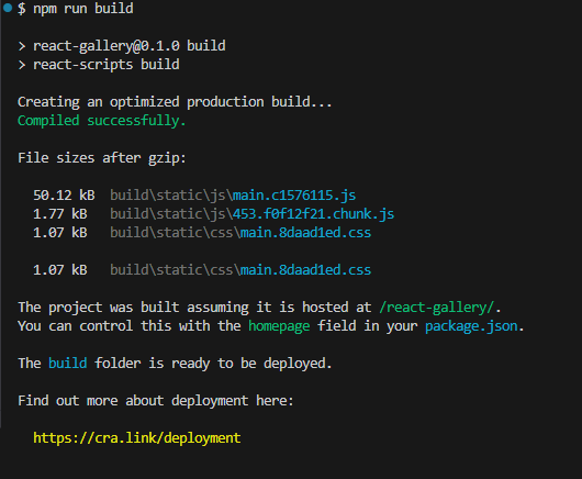
Open your newly created build folder to see a file directory similar to:
build
├── images
|   └── Your artwork that's featured in your gallery
└── static
    ├── css
    |   ├── main.abcdef01.css
    |   └── main.abcdef01.css.map
    ├── js
    |   ├── 123.4567890a.chunk.js
    |   ├── 123.4567890a.chunk.js.map
    |   ├── main.01234567.js
    |   ├── main.01234567.js.LICENSE.txt
    |   └── main.01234567.js.map
    ├── asset-manifest.json
    ├── index.html
    └── robots.txt
Take all contents of this build folder and upload them to wherever you want your app to live. Once you do, you should be able to play around with it.
Add-Ons & Challenges
If you want to continue with this project, here are some ideas you can add to further improve your app’s usability:
- Add keyboard functionality to cycle through images when the Popover is visible. Also add clickable Previous / Next buttons to turn the Popover into a more dynamic carousel.
- Add thumbnails to the Popover of a few images that share the selected image’s category tags, giving higher placement to those that share the most categories.
- Add a text-input search bar that shows images with titles that match or contain the input’s value.
- Expert Challenge! Figure out how this can be integrated into WordPress or some other CMS as a plugin.
CONGRATS ON A JOB WELL DONE!
Whether you take on any of the additional challenges or not, you should be proud of yourself. React can be confusing and complicated in the beginning, but once you understand how to build components, utilize useState and useEffect methods, and pass around properties and events, you can build anything your mind conceives!
In the next series, I’ll show how to expand on this Art Gallery with an interactive, timed slideshow.
Leave a Reply