We’re almost there! In this part, we’ll cover 2 topics:
- Add more functionality to your App and ImageCard components that will allow you to view images in a full-screen Popover modal.
- Add a shuffle feature that randomizes your images each time you load your app.
Let’s See Those Big Images
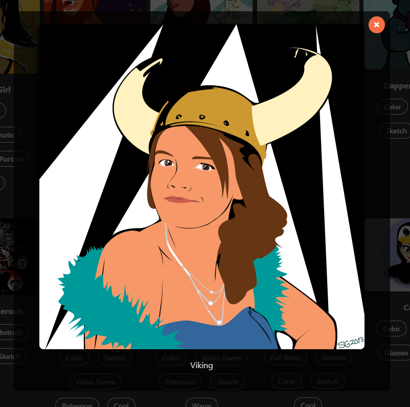
Click an image. A popover modal appears, displaying the full-size image, its title, and a close button, while darkening the background to give it the spotlight.
To do this, we’ll first modify the App component.
App.js
// Imports...
function App(){
// previously defined filters, images, toggleFilter, uniqueCategories, and filteredImages
const [selectedImage, setSelectedImage] = useState(null);
const openPopover = (image) => { setSelectedImage(image); }
const closePopover = () => { setSelectedImage(null); }
return (
<div className='App'>
{/* Previously built h1, paragraph, and categories container */}
{
filteredImages.length === 0
? (
<p style={{ color: 'red' }}><em>No images found for the selected categories.</em></p>
)
: (
<ImageGallery
images={filteredImages}
toggleFilter={toggleFilter}
onImageClick={openPopover}
/>
)
}
{
selectedImage && (
<div
className={`popover ${selectedImage ? 'show' : ''}`}
onClick={closePopover}
>
<div
className='popover-content'
onClick={
(e) => e.stopPropagination()
}
>
<img
src={`${process.env.PUBLIC_URL}${selectedImage.src}`}
alt={selectedImage.title}
/>
<p>
{selectedImage.title}
</p>
<button
className='close-button'
onClick={closePopover}
>
×
</button>
</div>
</div>
)
}
</div>
);
}
export default App;Here’s what’s been added:
- Added a new useState with an initial value of null for the selected image.
- Defined the two states of the popover using openPopover and closePopover.
- openPopover sets the selected image to whatever image the user clicked
- closePopover resets the selected image to null, removing any chance the app will become confused by what image is actually selected.
- Inside the App component function, we updated the <ImageGallery> element to pass along the onImageClick action. This action will then be sent down to the ImageCard component – the level where the event will actually be triggered by the user’s click action.
- Finally, when an image is clicked and the openPopover function is triggered, we build a new Popover that contains the full-size image, its title, and a close button.
- If the user clicks the close button OR clicks outside the Popover window, the closePopover function will be triggered and the Popover will disappear and the selectedImage variable will be reset to null.
Let’s quickly update the ImageGallery component to allow it to pass along the onImageClick action to the ImageCard component.
ImageGallery.js
import ImageCard from './ImageCard';

const ImageGallery = ({ images, toggleFilter, onImageClick }) => {
  return (
    <div className="gallery">
      {images.map((image, i) => (
        <ImageCard
          key={i}
          image={image}
          toggleFilter={toggleFilter}
          onImageClick={toggleFilter}
        />
      ))}
    </div>
  );
}

export default ImageGallery;
ImageGallery now accepts the onImageClick parameter and simply passes it along to the <ImageCard> element.
Next, let’s update the ImageCard component to trigger the openPopover function when it is clicked.
ImageCard.js
const ImageCard = ({ image, toggleFilter, onImageClick }) => {
  return (
    <div className="image-card">
      <img
        src={`${process.env.PUBLIC_URL}${image.src}`}
        alt={image.title}
        onClick=(() => onImageClick(image))
      />
      <p><strong>{image.title}</strong></p>
      {/* categories */}
    </div>
  );
}

export default ImageCard;
This component now accepts the onImageClick parameter and triggers the function when the image is clicked, passing the matching image data back up to the App component.
Finally, let’s style the new Popover in our App.css file.
App.css
/* ...Previously defined styles... */

.popover {
  position: fixed;
  top: 0;
  left: 0;
  right: 0;
  bottom: 0;
  background-color: rgba(0, 0, 0, .7);
  display: flex;
  justify-content: center;
  align-items: center;
  z-index: 1000;
  opacity: 0;
  visibility: hidden;
  transition: opacity .3s ease, visibility 0s .3s;
}

.popover.show {
  opacity: 1;
  visibility: visible;
  transition: opacity .3s ease, visibility 0s 0s;
}

.popover-content {
  background-color: rgba(0, 0, 0, .7);
  padding: 25px 50px;
  border-radius: 8px;
  position: relative;
}

.popover-content img {
  max-width: 100%;
  max-height: 80vh;
  object-fit: contain;
  box-shadow: -5px 5px 10px rgba(0, 0, 0, .7);
}

.close-button {
  position: absolute;
  font-size: 1.25em;
  font-weight: bold;
  top: 10px;
  right: 10px;
  background-color: #f96e46;
  color: white;
  border: none;
  border-radius: 50%;
  padding: .25em .5em;
  cursor: pointer;
}
Shuffle & Deal ‘Em Out
For a bit of fun randomness, let’s add a shuffle function to keep the app interesting on repeat visits. This bit is only added to the App component and, honestly, is completely optional. But, it is a good way to get introduced to React’s useEffect method.
App.js
import { useEffect, useState } from 'react';
// Other imports

const shuffleArray = (array) => {
  const shuffledArray = [...array];
  for (let i = shuffledArray.length - 1; i > 0; i--) {
    const j = Math.floor(Math.random() * (i + 1));
    [shuffledArray[i], shuffledArray[j]] = [shuffledArray[j], shuffledArray[i]];
  }
  return shuffledArray;
}

function App() {
  // Previously defined filters, images, selectedImage

  useEffect(() =>{
    const shuffledData = shuffleArray(data);
    setImages(shuffledData);
  }, []);

  // Previously defined toggleFilter, uniqueCategories,
  // filteredImages, openPopover, and closePopover

  return ( ... );
}
export default App;
What changed?
- We added a general function named shuffleArray that takes in an array of stuff, shuffles it using a randomizing for loop
- This loop contains a Math.random() method that takes the current placement of an array item and assigns it to a different, randomly chosen placement that hasn’t already been occupied.
- We then removed const images = data and are now redefining the images variable through the shuffleArray function.
- Nothing else needs to change in the other variables, functions, or the returned HTML.
That’s all there is to the shuffle functionality! Now, the more images you add to your gallery, the more unique each subsequent visit will be!
In the next part, we’ll wrap up this project by reviewing what we’ve built and prepare the project to launch in a live environment.
Leave a Reply