In this part, we’ll:
- Discover the relationship between parent and child components and how styles, properties, and actions flow through the components
- Build the ImageCard and ImageGallery components and update the App component to properly use those components
The Parent-Child Relationship
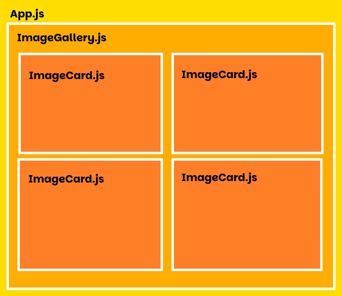
For our React app, we will have this basic component tree:
great-grandparent --- index.js
  V                     V
grandparent --------- App.js
  V                     V
parent -------------- ImageGallery.js
  V                     V
child --------------- ImageCard.js
Styles and properties flow from the topmost component and apply to each level underneath it. Each individual component can have its own batch of styles and properties that could add to or override its parent’s styles or properties.
For example:
- index.js has the styles background-color: red and color: green
- App.js inherits the background-color and color from index.js, but overrides the color style to blue. The index.js color remains green.
- ImageGallery.js inherits the unchanged background-color from App.js (flowing through from index.js) and the overwritten color styles. Here, the background-color is overwritten to purple.
- ImageCard.js now inherits the styles background-color: purple and color: blue.
Styles and properties flow in a top-down direction. Actions and reactions, however “bubble” from the bottom up. Say the ImageCard.js component includes a button with an onClick action that would change some a headline in App.js.
great-grandparent --- index.js
  ^                     ^
grandparent --------- App.js
  ^                     ^
parent -------------- ImageGallery.js
  ^                     ^
child --------------- ImageCard.js- The user clicks the button in ImageCard.js. The action is captured as an event bubble in this component.
- The event bubble rises to ImageGallery.js. No functions in this file are activated by this event.
- The bubble continues to rise from ImageGallery.js to App.js. Here, the changeTitle function is activated by the arrival of the event bubble. Once the function finishes, the bubble continues to rise through the component tree.
- The event rises to index.js. No functions exist in this file to react to the event bubble. The bubble rises out of index.js and is released into the ether.
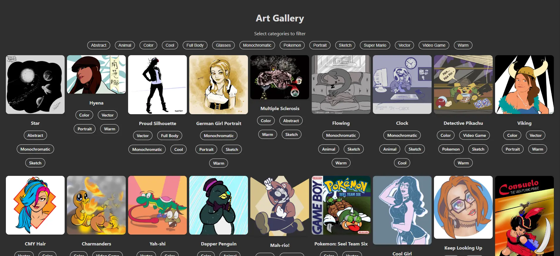
Build the Components
The basic container layout of the components will be something like this:
Start Small & Build Up
With the basic roadmap laid out, we’ll start with the bottom-most component.
In your src folder, create a new file named ImageCard.js, and add the following code:
ImageCard.js
const ImageCard = (image) => {
  return (
    <div className="image-card">
      <img src={`${process.env.PUBLIC_URL}${image.src}`} alt={image.title} />
      <p><strong>{image.title}</strong></p>
    </div>
  );
}

export default ImageCard;
Some notes about this code:
- This component inherits the image property from its parent component (which we will write next).
- Each attribute for the image tag is defined by variables, which must be contained within { and }.
- If an attribute is defined by multiple variables, enclose its definition within ` tick marks. Each enclosed variable must be written as ${ … }, like ${process.env.PUBLIC_URL} included in the img’s src attribute.
- process.env.PUBLIC_URL is a safe, convenient way to point to the app’s root folder without exposing the actual directory.
- export default ImageCard allows other components to utilize it as its own <ImageCard /> tag.
Next, build the ImageGallery component by creating a new file in your src folder named ImageGallery.js. Add the following code:
ImageGallery.js
import ImageCard from './ImageCard';

const ImageGallery = (images) => {
  return (
    <div className="gallery">
      {images.map((image, i) => (
        <ImageCard
          key={i}
          image={image}
        />
      ))}
    </div>
  );
}

export default ImageGallery;
Some notes on this code:
- First, we import the ImageCard component from the ImageCard.js file (the extension is not necessary for JavaScript files).
- The ImageGallery inherits the images property from its parent.
- Inside the gallery container, we create an ImageCard for each image included in the images property using the map loop function (more efficient than for or foreach loops).
- When using the map loop, each element it creates requires a unique key, which is why the i variable is included. The i variable is increased by 1 each time the map loop iterates.
- The ImageCard‘s image attribute is set to the inherited image property, which contains the key/value pairs you created in your images.json file back in Part 2 (i.e. title, src, and categories).
Next, in your src folder, update your App.js file:
App.js
import './App.css';
import ImageGallery from './ImageGallery';
import data from './images.json';

function App() {
  return (
    <div className='App'>
      <h1>Art Gallery</h1>
      <ImageGallery
        images={data}
      />
    </div>
  );
}

export default ArtGallery;
The changes we made to this file:
- We are now importing App.css, ImageGallery.js, and images.json – setting the JSON to the data variable.
- Inside the App container, we added the <ImageGallery /> tag and gave it an attribute images that contains the images.json data.
- The images.json data is sent down to ImageGallery, which parses the data into individual images, each of which is fed into the ImageCard component.
Update the Styles
Now that we have the basic components in place, let’s update the App.css file.
App.css
.App {
  text-align: center;
  padding: 20px;
  min-height: 100vh;
}

.gallery {
  display: grid;
  grid-template-columns: repeat(auto-fill, minmax(200px, 1fr));
  gap: 8px;
  justify-items: center;
}

.image-card {
  text-align: center;
  max-width: 200px;
}

.image-card img {
  max-width: 100%;
  border-radius: 10px;
  box-shadow: 0 4px 6px rgba(0, 0, 0, .1);
  cursor: pointer;
}
Remember, these styles are imported into App.js, which then feeds them into ImageGallery.js and ImageCard.js.
In the next part, we’ll add functionality to filter the images by clicking one or more category tag buttons. The app will then display only those images that contain the selected tag(s) in its category list as defined in your images.json file.
Leave a Reply